1. What skills have you developed through this module and how effectively do you think you have applied them?
Well, in this module, I've developed several practical skills which I have transferred to other projects, but I think the way of thinking taught in the module will probably be the most valuable skill I have acquired in the end. The very idea of 'Visual Language' and how shapes make up images, the 'vocabulary' of pictures we use and whatnot. I use a lot of vector-based artwork in my designs, and learning to use simple shapes to explain, in comparison, complex type, proved useful.
I think, to a degree, everyone (well... most people.) in our class will have had some grasp of visual language before they started the module, and what I believe has happened for me is that it has highlighted the 'complex simplicity' of images, forcing me to analyse an image to grasp the background message makes it easier to understand how your audience might find your work confusing or overly elaborate.
That said, on the practical side I found the photography lessons quite beneficial, in that I have used some of the techniques we were shown for a long time, but getting to know how to use them professionally, and knowing the terms used to describe them, i feel, has given my work in that field more of a professional edge, and less of a 'I did it by accident, but it looks good.' vibe.
I think my attitude towards what I was getting out of the lessons has changed since the start, it's easy to look upon this module at face value, and if you stick to that attitude then you're not going to come away from it with much.
An example of where I've applied the knowledge I've gained from this module would be the 'hymen' poster I created for the don't panic brief [at http://0ugd103.blogspot.com], I managed to use near-enough iconography to get my point across and even though it was a two colour image with a simple dotted line, a single header and a scissor icon, it still managed to offend people and those I showed it to knew exactly what I was getting at immediately.
2. What approaches to / methods of research have you developed and how have they informed your design development process?
Research has always been the bane of my graphic design work, I freely admit that I am not nearly as good as I should be due to this, it's not that I resent carrying out research, I am just terrible at going about it. So, with this module, I'd say perhaps one of the things I've learned to do is use a camera as a source of primary research. I've been using it more to document my work, and, for example with the book brief, I would take photos with a point-and-click of what I intended to create before taking the final shot with an SLR, just to make sure it would come out as it looked in my head.
One thing I have developed, which, although may not strictly be research as such, is at least related in terms of my design process, is the idea of quickly sketching out ideas on worksheets, all too often I find myself drawn into creating small, tight drawings at the development stage when it is unnecessary, and since starting this brief I have tried to take more of a loose attitude to my initial ideas, I think this is apparent with the last few briefs we've been set.
3. What strengths can you identify in your work and how have/will you capitalise on these?
This time round, I think the strengths which have become apparent for me are things like my ability to take one visual and try and expand on it as much as possible (For me, anyway...). With the sound waves/bars I've been looking at, it was frustrating working with something which I felt was so fixed and static, but I kept pushing at it because I didn't want to have a load of scattered ideas by the end of the module and no real focus. This turned out to be the right way of going about it for me, as the visuals I have ended up with look quite different to those I started with.
On that note, I believe my 'finished' visuals are of a high quality, the work I produce I am proud of, particularly any final resolutions. Given the creative freedom we have within the class (In comparison to the 'real world') I wouldn't feel valuable as a designer if I didn't personally like every final solution I came up with, and I have a tendency to really take time and perfect my finals. I also feel that recently, I've changed my work ethic with regards to the course, and this has improved my output, not just in quantity but quality as well. For example, instead of going upstairs and getting an A3 inkjet printout, I'll go downstairs and spend a bit of money getting a nice, suitable print for the work, work which I will have spent twice as much time on as before.
Mixed media is something I've also dabbled in this time, I've used paints and inks for, I think, the first time on this course. Not a whole lot, but it is for me, and it's hard to peel yourself away from a mac.
4. What weaknesses can you identify in your work and how will you address these more fully?
Although I've been using my blogs a lot more lately, I feel I've let it slip a bit in terms of visual language, I set up a second blog specifically for the third module and most of my activity has been on that, so I think my research has suffered as a result. During crits, I'd look at other people's blogs and see that they'd padded them out with online research, so I'd go away from it and upload a post, but then soon forget about it after getting a new brief. Generally on the course, though it's unintentional, visual language seems to take a back seat when we've got other briefs on the go, especially as the deadline seemed so far off. I think to address this I need to maybe select a couple of days a week where my time spent at home is focused on visual language (or, whatever's next for that matter...) so that it's never too far from my mind. If I can keep up to date with my new blog, there's no reason I can't with updates for visual language.
Another thing I feel I've let myself down on with this module is my punctuation and general attendance, at this stage of the module I'm having to scour my draw and my flat for work I've done, but can't be sure I was there at the right time or at all. I tend to stay late at college, but it doesn't really compensate if I'm missing taught sessions.
5. Identify five things you will do differently next time and what you expect to gain from doing these
- Experiment more. Next time round, I think it'd be beneficial for me to explore new media and ways of creating images. Even if it starts out on paper and ends up being scanned in, I think the tools available on a mac are seeming more pre-determined to me now than ever, and thus, showing their limitations.
- Buy paper stock. So far this year a lot of my work has ended up coming out on 90gsm bleached white paper, which while functional, isn't very interesting. I've tried to include a bit more variety with my choice of paper lately but I'm aware that I can do more.
- Set up a blog for every module. I found setting up a blog for the third module made the whole idea of blogging seem fresh, so i was more inclined to update it. I think this is good practice anyway as it makes navigation easier and also allows for more creativity when it comes to layout and whatnot. Plus, I'm aware that we'll be learning Dreamweaver next year so maybe I should get used to tweaking around with HTML again...
- Set personal deadlines. I'm getting sick of it coming to the last week and having to rush around to make sure I've got everything done. I think I'd work more efficiently if I had deadlines that were closer together as I worked through the module, because I seem to snap into action when a deadline rolls around so my logic is if they happen more frequently I'll keep on top of things easier.
- Back up EVERYTHING. With this module, I've had severe technological issues with my PC at home (I shall be buying a mac next month...), the saturday before module hand in, my PC crashed, and would only start in safe mode. Then it wouldn't recognise my USB key or hard drive, so I had to spend hours and hours over the weekend trying different things until I got it running again. And for someone who relies so much on their digital work, it could've been a catastrophe which would've been quite hard to explain without dragging it into college to prove it was broken.
6. How would you grade yourself on the following areas:
Attendance: 2
Punctuality: 2
Motivation: 3
Commitment: 5
Quantity of work produced: 3
Quality of work produced: 4
Contribution to the group: 5
Showing posts with label ougd104. Show all posts
Showing posts with label ougd104. Show all posts
Tuesday, 31 March 2009

Wednesday, 11 March 2009
Nothing In Moderation
Prepare your eyes, for I am about to unleash an incendiary payload of 'What Is A Line' work upon your heads. I've been trying to work out the best way to visualise sound with line, I've been using music software (Reason, Ableton) to create music visualisations, and to be honest, it's quite restrictive as to what you can do, there are only so many 'wave' and 'bar' visualisations out there. One way to get around this is to layer them on top of each other, this creates more interesting visuals, and some of them end up looking like landscapes - a lot like the 'Unknown Pleasures' artwork I was first inspired by.
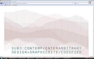
That's the splash page on his website, see the bars making up mountainous terrain? I saw that and though 'Wow, Peter Saville, what a guy.' And decided to play around with his idea a bit to see what I could make of it. God bless Illustrator:
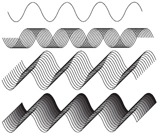
Copying that single wave and layering it has made it so much more interesting, all thanks to Saville. Staying up all night while my Leeds Met contemporaries slumber peacefully, all to meet deadlines, feels less like agony knowing that good ol' Saville will have done the same thing before I was even born.
In the image at the bottom, I've shaded it in Live Paint to give it more of a 3-D feel but, I'll avoid doing that with any final resolutions because it's escaping the entrapment of 'line' - and even if it isn't, I'll feel like I'm cheating.
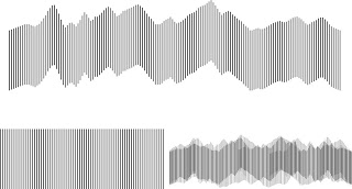
I've used Illustrator [Swiss Army Programme] to replicate the Saville website, I started off with a set of lines drawn out, selected them individually and moved them around to line up with the wave lines produced by 'Evil Has Never' by Union of Knives. I really love the visuals I'm getting from this, and I don't feel the need to over-complicate my work when it comes to the What Is A Line brief, embellishment is a prison in this case.
Anyway, I was looking into Peter Saville a bit more after that initial atomic flash of inspiration, I've read the Factory Records Graphic Album [Where I first got the idea from...] in full, and from that I've been on his personal website. Take an eyeful of this:

That's the splash page on his website, see the bars making up mountainous terrain? I saw that and though 'Wow, Peter Saville, what a guy.' And decided to play around with his idea a bit to see what I could make of it. God bless Illustrator:

Copying that single wave and layering it has made it so much more interesting, all thanks to Saville. Staying up all night while my Leeds Met contemporaries slumber peacefully, all to meet deadlines, feels less like agony knowing that good ol' Saville will have done the same thing before I was even born.
In the image at the bottom, I've shaded it in Live Paint to give it more of a 3-D feel but, I'll avoid doing that with any final resolutions because it's escaping the entrapment of 'line' - and even if it isn't, I'll feel like I'm cheating.

I've used Illustrator [Swiss Army Programme] to replicate the Saville website, I started off with a set of lines drawn out, selected them individually and moved them around to line up with the wave lines produced by 'Evil Has Never' by Union of Knives. I really love the visuals I'm getting from this, and I don't feel the need to over-complicate my work when it comes to the What Is A Line brief, embellishment is a prison in this case.
Tuesday, 17 February 2009
One Day Goodbye Will Be Farewell
Somebody down there likes me, my computer has been fixed :D


Upon switching it on for the first time in nearly a month, my Kaspersky internet security doo-dah started updating, and when it did I noticed it came up with a download bar that reminded me of the Unknown Pleasures artwork I'm looking at for the What Is A Line brief, so with my uncomprehensible quick-thinking [much like the reflexes of a cat on speed] I whacked out a few screen-grabs to put down as research. Check it:
Same sort of thing I want to do, only I want to use sound as the source material for the imagery. I was thinking of getting an album I like, taking sound wave bars from each song and doing it as a set of posters. Like a visual interperetation of the album. Feedback on that would be nice [hint hint.] But yeah, then I whacked the three of those images together in Photoshop and adjusted the gradient to make it look a bit more like Unknown Pleasures. See:

Tuesday, 10 February 2009
Hear Me Now, All Crimes Should Be Treasured If They Bring Thee Pleasure Somehow
What is a line - stop bugging me about it, I don't know. Given my initial ideas and research on the subject, I now intend to follow the audio-visual route, I want to stay far away from the idea that a line has to be a 2D entity, instead I want to be quite abstract. I'm drawing great inspiration from the Unknown Pleasures artwork and from that [given that it's 100 recorded pulses from the first recorded Pulsar...] I intend to look into astrology and sound recording, but also to see if I can create some interesting visuals using plotted star maps and different readings, ie: gamma, radio, etc.


I want to record people saying 'Line' and words relating to it, and bring up wave bars from the audio which I can then trace and manipulate, although it would be tempting to create an animation with them since they move anyway I want to try to limit myself here, because I think that'll force me to squeeze more potential out of the subject. Maybe limit my colour palette as well or something, I dunno. But I want to create a series of posters from
my research, and I don't just want them to be pretty images I want them to represent some of the data i gather. Maybe some weird pictoral form of graph or something. Anyway, time will tell and all that yeah?
Maybe get into a bit of the ol' scientific theory and see how the linear structure of time could possibly be bent?
Lovely bit of Graphic Equalizer there.
Pulsar waves. Pretty eh?
Monday, 2 February 2009
Attack Of The Mega Bra
Right, as I predict everyone else in our class has, I've decided to go for the 'last-minute-panic' approach for the What Is A Line brief. First up is a little idea I pieced together where i've tried to think outside the proverbial cube, looking at Line as more of an idea than an actual 2D image. So yeah, i thought of using thickness of line as a way of documenting, so basically a timeline, where the thickness of the stroke corresponds to a particular activity. Gaze upon it with your eyes like:

Next is a little video I found [because it seems oh-so-fashionable to have videos on here for this brief...] based upon barcodes, it's stop animation, which means there's a slight chance I might even be able to replicate it, and I thought it was quite quirky:
I want to keep to the idea of line with this project visually, try and keep it as fixed and linear as possible, rather than try to manipulate line to create complex images, though this may change as I live my life and all that. An example of what I mean by this would be the work Peter Saville did for the cover of 'Unknown Pleasures' - a Joy Division album. If you don't like Joy Division or don't know who they were, switch off your computer, buy a couple of disposable barbecues, seal all ventilation in the room, light them, and wait. Only kidding, have a cup of tea or something.
Anyway, without further ado, here's Unknown Pleasures:

Apparently it's the reading given off by a star exploding, looks nice though eh? Anyway yeah i also came across another Video [Wow, yet more moving pictures!] which was based on this artwork for the song 'Disorder', really like what the guy's done here with this, if you think of it as basically starting off as a flat image like a barcode and all the possibilities that spring from there, it's quite impressive:
I'm not trying to turn this project into an Ian Curtis tribute or anything by the way, I just found it relevant and that. I think it'd be just spiffing to take something like that found anywhere in life, like for example someone's furrowed brow or the lines on a chisel and used that as a starting point to make something psychedelic.

Next is a little video I found [because it seems oh-so-fashionable to have videos on here for this brief...] based upon barcodes, it's stop animation, which means there's a slight chance I might even be able to replicate it, and I thought it was quite quirky:
I want to keep to the idea of line with this project visually, try and keep it as fixed and linear as possible, rather than try to manipulate line to create complex images, though this may change as I live my life and all that. An example of what I mean by this would be the work Peter Saville did for the cover of 'Unknown Pleasures' - a Joy Division album. If you don't like Joy Division or don't know who they were, switch off your computer, buy a couple of disposable barbecues, seal all ventilation in the room, light them, and wait. Only kidding, have a cup of tea or something.
Anyway, without further ado, here's Unknown Pleasures:
Apparently it's the reading given off by a star exploding, looks nice though eh? Anyway yeah i also came across another Video [Wow, yet more moving pictures!] which was based on this artwork for the song 'Disorder', really like what the guy's done here with this, if you think of it as basically starting off as a flat image like a barcode and all the possibilities that spring from there, it's quite impressive:
I'm not trying to turn this project into an Ian Curtis tribute or anything by the way, I just found it relevant and that. I think it'd be just spiffing to take something like that found anywhere in life, like for example someone's furrowed brow or the lines on a chisel and used that as a starting point to make something psychedelic.
Subscribe to:
Posts (Atom)