Sunday 14 December 2008

The Crazy World Of Arthur Brown

After finally reaching the end of the first module, which, in hindsight, actually went quite quickly considering the amount of time we've been on the course, we've now begun work on the second module which so far has been concentrating on research techniques. [Oh - and a little note, I've got a friend who does BA Graphics at Leeds Met and so far since September they've had three projects. And one of them involved taking pictures with a camera phone. Jeeeesus...]

So yeah, our first task with the new module was to take 100 pictures around Leeds of people, places, objects, textures and type. I was using my 8 Megapixel point-and-click, which has a broken display, so really all the images were guess work like using a film camera. Still, some of the images came out a bit, well... lame. So I used Photoshop to tweak them and make them look a bit more professional, here's a few examples for ye -

Original...


Edited...


Original...


Edited...


I spent hours going through every photo and editing it so it looked better because I figured 'Oh, well when we're in on Monday we'll probably have to select the best few' or something, and I didn't want to show up with a load of pants looking photography. Still, saves me editing them later on.


The next step was to take a theme from our pictures and elaborate on it through research, so I ended up choosing Smoking because I thought the end product to the research might be really interesting, like using cigarette ash to paint a picture of lungs or something. We needed to get 10 Primary sources of research and 10 Secondary sources of research. First, I created a survey and I wanted the results to give me a feeling or mood about smoking as well as statistical data, so I asked questions like 'How does it feel physically to be desperate for a cigarette?'


I also emptied the contents of my ash tray into a plastic sleeve so it'd give the texture and smell and everything. One of my secondary sources was a South African anti-smoking campaign i found on adsoftheworld.com, it had things like a 48 sheet on top of a tower block saying "Jumping from this building when pregnant may harm your baby" and the tagline "You wouldn't ignore this warning, so why ignore those on cigarette packets?" [http://adsoftheworld.com/media/print/national_council_against_smoking_building_billboard]


Some of my photographic research into smoking:


After the smoking research, we were put into groups of four, I was with Liam, Chloe and Carl, and together we decided to research 'Melancholly' for the next brief, unfortunately I was in Watford for the Monday and Tuesday afterwards so I missed the beginning of the brief. When I got back the guys told me we were looking into S.A.D. - Seasonal Affective Syndrome, so I began looking into daylight emitting lamps and where S.A.D. is most prevalent and the like.


We later decided to do a photoshoot of ourselves dressed up in all the winter clothing we could fit on ourselves in the photography studio, before Liam edited them in Photoshop and I came up with a title and logo for us, 'It might never happen' - ie: Cheer up mate, it might never happen. Chloe said she'd like the logo to be similar to the United Colours of Benetton logo, so I tried to keep it in that sort of style, only, different.


In the end, I felt like although our work collectively was of a decent standard, and the photos came out quite professional-looking and all that, we failed to collate all the information we had and actually create a purpose for what we were doing. The posters we did [sadly they're on my account at Uni but I didn't have a USB Key with me to take them home...] looked decent, but how was it actually helping to combat S.A.D.?

Sunday 23 November 2008

One Toke Over The Line

Right. Here it is. I'm gonna put all the stuff I've been doing up here in one massive post. I pray to god my computer doesn't crash. Right, I've been going over the work I've already done, and for the colour project the final pieces I came up with ended up coming out pixelated and lame, so I've just spent hours tracing them in Illustrator so that the print quality is higher, and here they are in all their vector-based glory:


Right, I have no idea why it keeps inverting the colours but it's really starting to piss me off. Anyway yeah, these are the 5 characters that make up half of my solution to the Colours brief. They're meant to be orange.

Anyway, the most recent brief we've had has been the 'No News Is Good News' one, and I researched into the subject of the current recession and global financial crisis, for the last brief I created a Financial Crisis version of the monopoly board to use as a mail spot to highlight the current situation. Here's my edited version of the monopoly man:


I've really been going overboard with the Illustrator work lately, I found the classes we had to be really helpful and I've been incorperating what I learned into a lot of my work. Anyway yeah, here's the monopoly board itself:


Nice eh? So yeah, I'd send a 'travel size' copy of this, along with a letter explaining that due to the current financial crisis all the pieces had been reposessed. And yeah, when I printed it out this was in two colours as the brief dictates, but I made it in full colour originally. Before this, we had to create a set of posters along the same lines, so I created these:


Again, going all out with the vector work here. I'm gonna try and upload more stuff tomorrow when I come in because I'm sure I've got more work on the college macs.

Safe.

Sunday 2 November 2008

I've come about the shoes.

While I was searching through my files for the images in that last post I stumbled across some random fings i dun before. So, without further ado, here they are in all their glory: [For some reason, the colours are coming out all wrong. Still.]

This is a website mockup I did for my friends' vending machine business...


Before I got into my last college, I made up a few briefs for myself to add to my portfolio and bring to my interview, for one of them I decided to design the layout for a CSS album, this was my initial idea...


But in the end I scrapped this idea and decided to go with robotic arms...


For the front cover, I tried to be innovative and thought of using an etch-a-sketch with pre-installed designs, so that the user could make their own front cover. I was inspired by that Beck album, can't remember the name...


Oh yeah, I forgot the other part of the inlay. For some reason the last image on the right isn't there, but it was robotic arms playing drums.


Ta daaaa.

Trust me, I'm a stomach.

Right, time for that update I'd promised. First up, the 'Orange' project. We were all assigned a colour at the start of the course when we were given our magical plastic portfolios of power, I got an orange sponge. We had to gather 10 other items that were orange, so I got an orange rubber skeleton, some plastic knives, air fresheners, a glow stick, a scarf, and a few other things. Thank Christ for poundland.

Anyway, we were grouped together in order of colour so in our group we were told to organise our items in different ways, darkest to lightest, reddest to yellowest, etc.


So we spent a while trying different combinations, layout the items out differently and so on, and then as a class we pooled all of our resources to make our own colour wheel around the class, sadly at this point my camera broke...


Anyway, after this we were set a brief to create ten 150mmx150mm 2d images, as i explained before - and here are some of the images I came up with...


Not bad eh? But these are hand drawn, and for that reason the quality I got at the end when I printed them was quite poor, very pixelated. So now I want to re-do them in Illustrator so that I can scale them to any size I want and get a decent printout, plus, given that they were scanned at quite a low resolution on a home scanner, they are quite grainy.

More soon. I promise. :P
Much Love.

Tuesday 28 October 2008

Swedish Steve & The Ketchup Dillema

Given the fact that I don't have all the images with me to make the update I want to, I'm just gonna give you a quick rundown of some of the things I've been up to lately [Graphics wise, I don't want to be arrested...] 

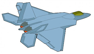
First off, I've been getting my teeth into Illustrator following the workshops we've had in the past couple of weeks. I'd always been boggled by the pen tool before, given that I've never really had any proper lessons in Illustrator - before I just used it to manipulate type and add stroke effects. Anyway, in one of the lessons we were shown how to trace a Fiat with the pen tool, and before I'd learned this I always assumed that the pen tool was by default a flat colour tool, so I couldn't just trace lines. Now I know I can. So I went home and started playing around with it, and in the end I traced an F-22 Raptor - not because I'm some sort of plane freak, but because it's mostly straight lines... [Hey, everyone's gotta start somewhere, right?]


It's not particularly amazing, but I'm happy with it and I know that now I know how to do this, it's really gonna affect my work, for example one of the briefs we were given was to create 10 150x150mm 2d pieces based on a colour we were assigned, I got orange, so to represent it I went with 'Orange is... fluorescent.' - I created images of people wearing fluorescent jackets in different jobs, ie; lumberjack, builder, footballer, etc. [I'll upload some examples when I get the files...] And now that I know how to trace and use live paint, I intend to go over what I've already done in Illustrator to give it a more polished and professional feel. Sick. 

I'm gonna save the rest of this update until I get my tings together enough to upload the images that go with it. Maybe some more illustrator tracing as well. 

Much Love.


Monday 29 September 2008

DJ Bob Hoskins Going Mental In A Dustbin

Just thought I'd share a few things with ye faithful on here, first up is the video for DVNO by Justice - since we're currently doing a spot of the ol' Typographic study, I figured this would be relevant as some of the text effects in this are amazing, and might influence anyone else who decides to watch, besides - it's a choooooon.


Next up is just some of the work I did at my previous college [Kensington & Chelsea College], again since we're studying type I figured I'd throw something in that's well, semi-related at least. We had a brief which was basically to come up with promotional material and album artwork for Stanton Warriors [http://www.stantonwarriors.com/], a semi-famous breakbeat DJ duo, anyway yeah I decided to do away with type and letterform for the majority of this project and instead rip off Peter Saville and whoever did that coldplay X&Y album by using a colour-coded alphabet.


Yep, confused more than my fair share of people with that. I didn't want to go down the obvious route of the stereotypical DJ-related imagery, headphones, turntables, etc. but I do admit that my idea was totally over the top and too complex to actually expect to work outside of our classroom. Still, the beauty was it was in our classroom.


If you look at my alphabet then look at the CD cover I designed [below] you should be able to tell that the coloured bars aren't just there for no reason, they spell out 'stanton warriors' in my alphabet.


Thursday 25 September 2008

Muse, anybody?


Just a few things I've been looking at lately which I thought were witty, cool, or just visually interesting. I'm always on http://www.adsoftheworld.com and ffffound.com - whenever my mind goes blank [which, to be fair, is quite often...] I look for inspiration here and more often than not I find it, anyway - here's a selection of some of the stuff that's been pleasing my cerebrum lately...


The image to my left is part of a campaign by tappening.com to highlight the carbon emissions created by the manufacture of water bottles, they're promoting using household tap water as a more eco-friendly option. I like it because it manipulates peoples' views on the American elections with the title 'Obama has a drinking problem' [there's also a similar image about John McCain] - it will immediately spark a reaction in anyone politically minded, regardless of which side of the fence they stand on.